
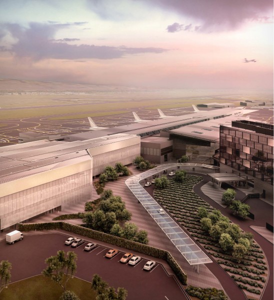
Adelaide Airport
Building a cohesive design system for Adelaide Airport's web ecosystem
Multi-tenant solution
Aviation
3 month engagement
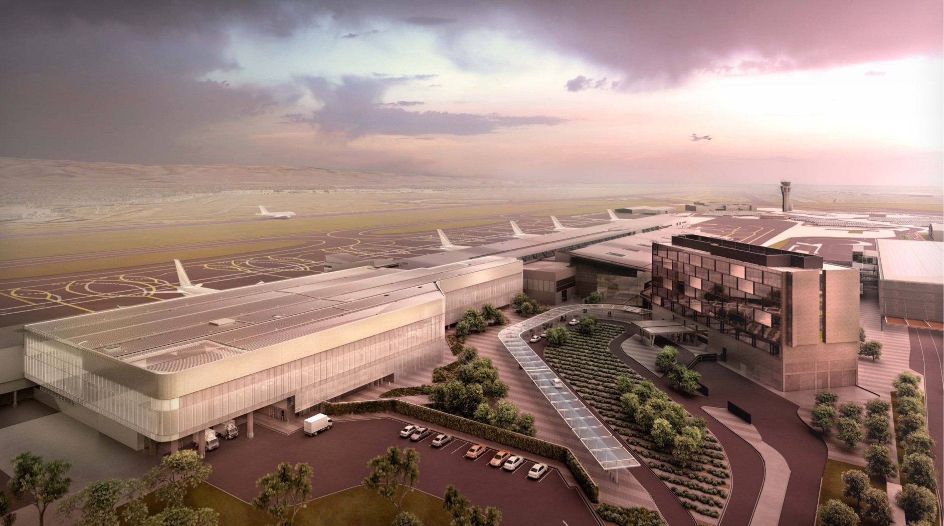
Adelaide Airport
Building a cohesive design system for Adelaide Airport's web ecosystem
Multi-tenant solution
Aviation
3 month engagement
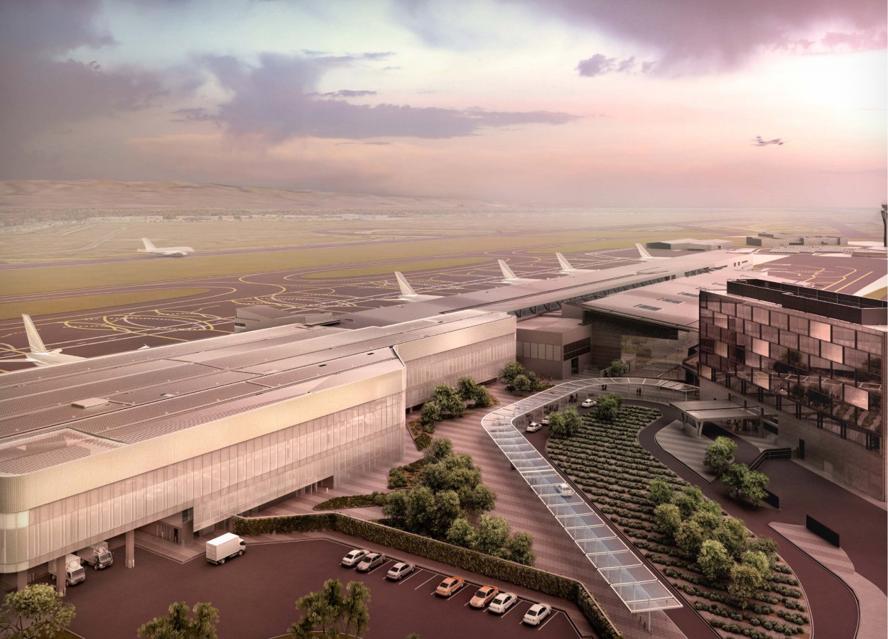
Adelaide Airport
Building a cohesive design system for Adelaide Airport's web ecosystem
Multi-tenant solution
Aviation
3 month engagement
Overview
Background
Just 6 km from Adelaide’s CBD, Adelaide Airport is more than a travel hub—it’s a business precinct, a gateway to South Australia, and a driver of economic growth. But its digital presence told a different story: fragmented sites, inconsistent design, accessibility gaps, and weak traveller engagement.
Industry data showed only 7% of travellers regularly engage with airport digital tools, a pattern Adelaide Airport knew it had to break.
Our partnership set out to design a connected web ecosystem that would unify disparate sites, improve accessibility, and make the digital experience as welcoming and useful as the physical one.
Activities
Information architecture & UX design
Traveler interviews & insights gathering
Development handover specifications
Competitor & category benchmarking for journey mapping activities
My role
UX product lead
Timeline
Platform set to launch mid 2025
Challenge
Working with a brand-new team, we had to balance ambitious goals with tight budgets and timelines. Content volume was high, audiences varied widely, and every phase required deliberate prioritisation and close cross-functional collaboration.
Challenge
Working with a brand-new team, we had to balance ambitious goals with tight budgets and timelines. Content volume was high, audiences varied widely, and every phase required deliberate prioritisation and close cross-functional collaboration.
Challenge
Working with a brand-new team, we had to balance ambitious goals with tight budgets and timelines. Content volume was high, audiences varied widely, and every phase required deliberate prioritisation and close cross-functional collaboration.
Approach
Understanding the traveller
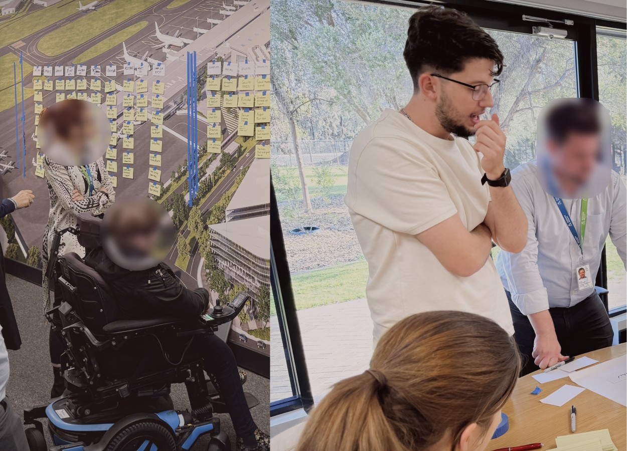
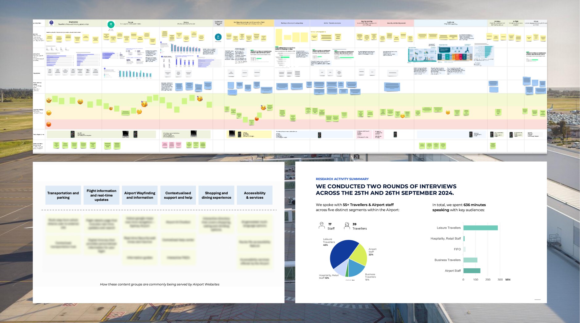
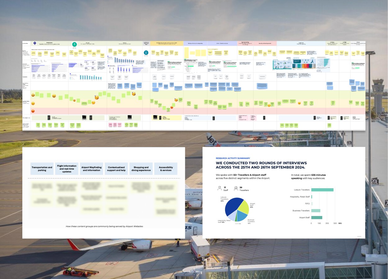
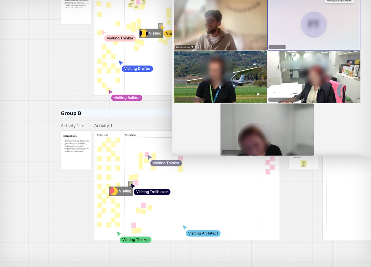
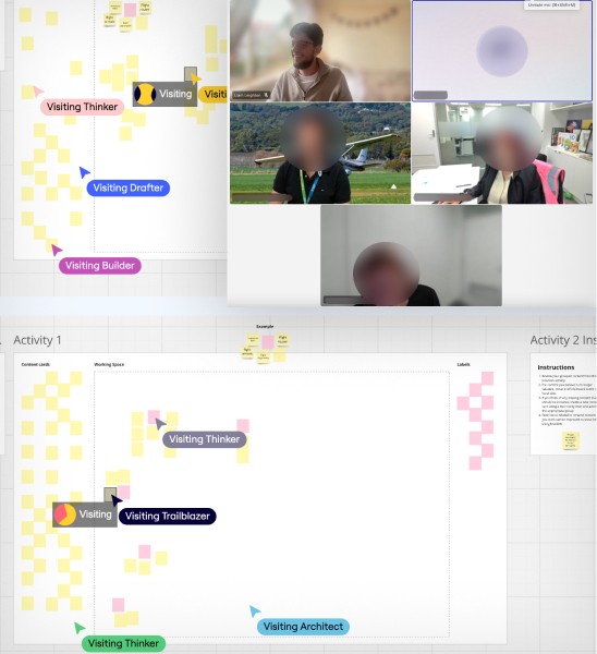
We began with one big question: What does today’s traveller experience look like and where does digital fit in? Through competitor audits, journey mapping, and over 55 in-person interviews with travellers and staff, we identified key friction points and opportunities. We paired this with SEO/SEM analysis to reveal how people actually search for and access information.
Approach
Understanding the traveller
We began with one big question: What does today’s traveller experience look like and where does digital fit in? Through competitor audits, journey mapping, and over 55 in-person interviews with travellers and staff, we identified key friction points and opportunities. We paired this with SEO/SEM analysis to reveal how people actually search for and access information.
Approach

Understanding the traveller
We began with one big question: What does today’s traveller experience look like and where does digital fit in? Through competitor audits, journey mapping, and over 55 in-person interviews with travellers and staff, we identified key friction points and opportunities. We paired this with SEO/SEM analysis to reveal how people actually search for and access information.
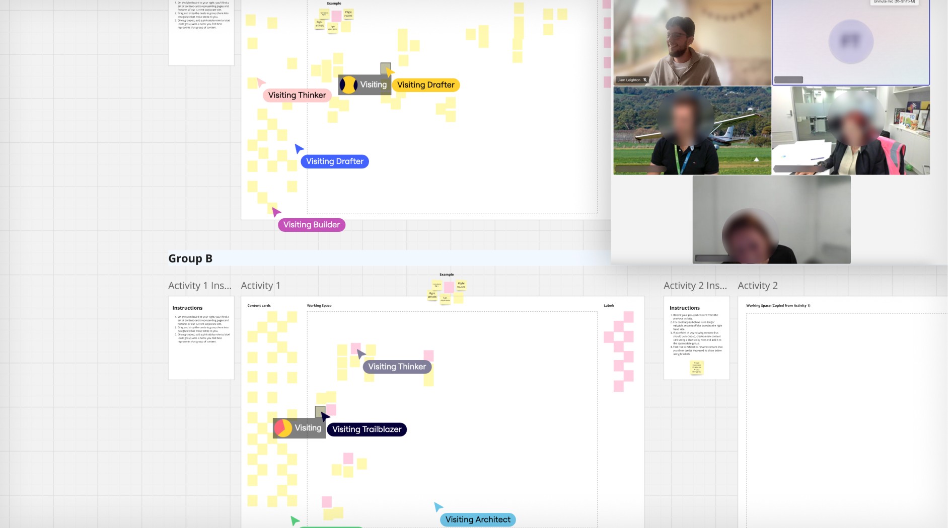
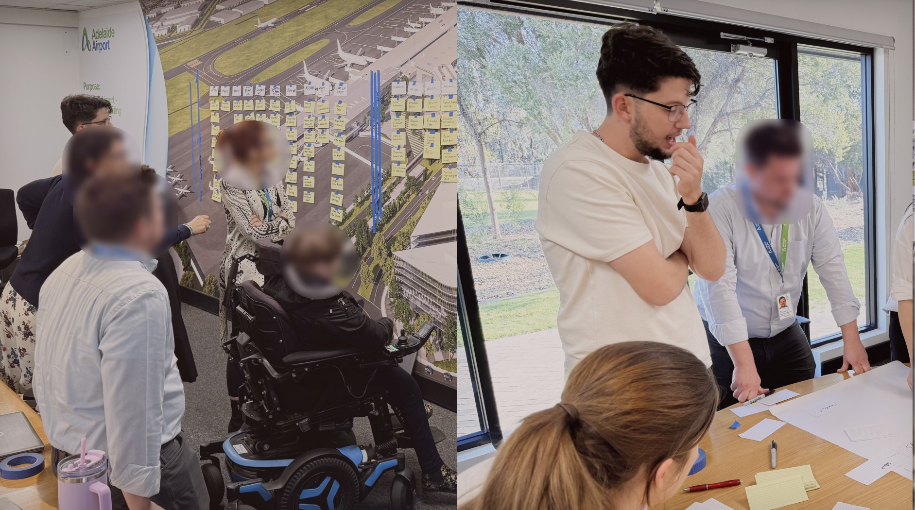
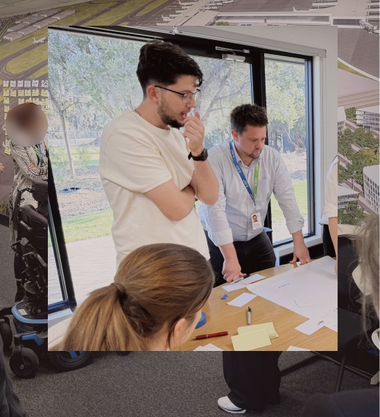
Co-designing release 1
Co-design workshops with subject matter experts helped us map out technical requirements, content needs, and cross-site priorities. The result: a clear product roadmap, build specifications, and a plan for unifying corporate, traveller, and property sites.
Co-designing release 1
Co-design workshops with subject matter experts helped us map out technical requirements, content needs, and cross-site priorities. The result: a clear product roadmap, build specifications, and a plan for unifying corporate, traveller, and property sites.
Co-designing release 1
Co-design workshops with subject matter experts helped us map out technical requirements, content needs, and cross-site priorities. The result: a clear product roadmap, build specifications, and a plan for unifying corporate, traveller, and property sites.
Uncovering the engagement gap
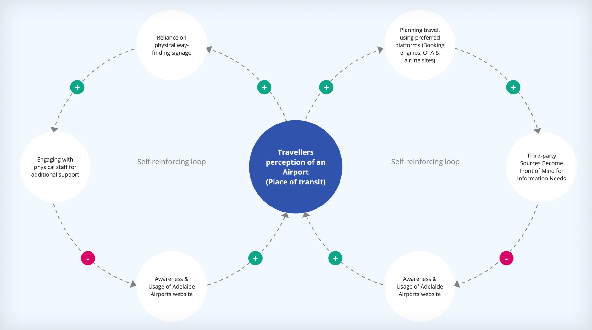
Research revealed a mental model at the heart of the problem: travellers didn’t see the airport website as a go-to resource. They relied on physical signage and third-party tools instead. Our solution: integrate digital prompts into the physical airport journey, making the website part of the real-world travel flow.
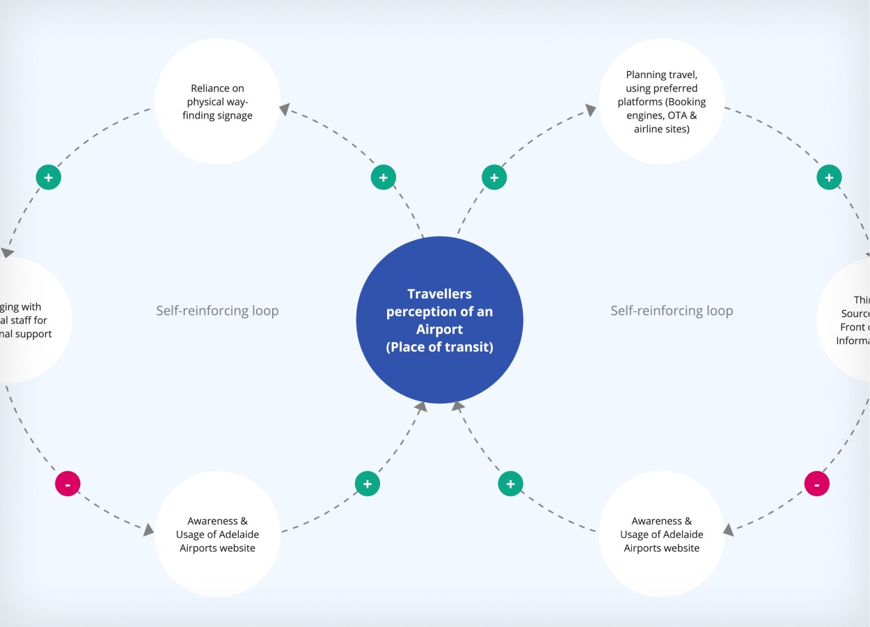
Uncovering the engagement gap
Research revealed a mental model at the heart of the problem: travellers didn’t see the airport website as a go-to resource. They relied on physical signage and third-party tools instead. Our solution: integrate digital prompts into the physical airport journey, making the website part of the real-world travel flow.
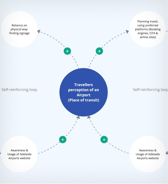
Uncovering the engagement gap
Research revealed a mental model at the heart of the problem: travellers didn’t see the airport website as a go-to resource. They relied on physical signage and third-party tools instead. Our solution: integrate digital prompts into the physical airport journey, making the website part of the real-world travel flow.
Building the design system
We created a cohesive, multi-tenant design system with 20+ adaptive modules, 12 CMS templates, and 13 integrations. Personalisation and context-aware wayfinding became core principles, enabling the platform to adapt to user location, needs, and timing.
Building the design system
We created a cohesive, multi-tenant design system with 20+ adaptive modules, 12 CMS templates, and 13 integrations. Personalisation and context-aware wayfinding became core principles, enabling the platform to adapt to user location, needs, and timing.

Building the design system
We created a cohesive, multi-tenant design system with 20+ adaptive modules, 12 CMS templates, and 13 integrations. Personalisation and context-aware wayfinding became core principles, enabling the platform to adapt to user location, needs, and timing.
Outcome
Phase 1 delivered the foundation for a three-year digital transformation: one platform, three distinct audiences, and a scalable system ready for future content, integrations, and engagement improvements.
The goal: dramatically improve visitor engagement and boost key conversions, like parking bookings.
(Visuals of the final product to come once launched.)
Figma-based design system with 20+ components and 13+ templates for high-frequency pages across three websites.
Three information architectures, traveller journey map, competitor audit report, and supporting assets.
Multi-tenant Umbraco platform.